
Facebook Graph
Hermit, Traveler or Gossiper? Which Facebook personality are you?
I wrote this article (in conjunction with Daniel Dewar) when I was working at Datalicious and it first appeared on their Blog in 2014.
Using a basic data visualisation tool, you can visualise your social network and gain an insight into your Facebook personality.
As the world becomes more digitalised and our relationships become more interconnected, sometimes we don’t realise the sheer amount of data we generate (and deal with) everyday.
We create metadata by calling a friend, generate page views by reading a blog post and we create nodes and edges by expanding our social networks, increasing the complexity of our digital lives.
While communications metadata can be used for national security purposes and pageviews are utilised to monitor website traffic, what could we do with our own social network data? Is it just a colourful graph or is there something valuable in analyzing the structure of our social lives?
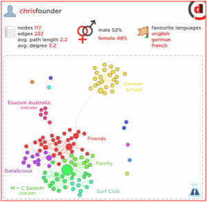
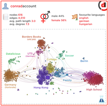
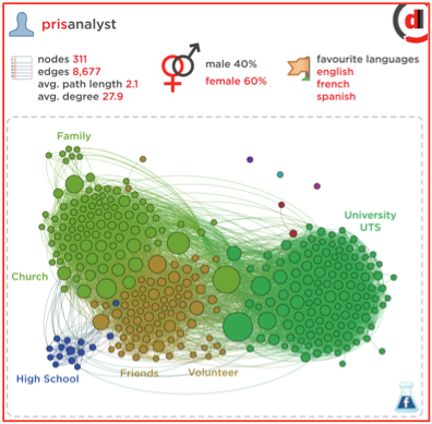
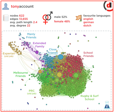
We tried to answer this questions by collecting, analysing and visualising the Facebook networks of eight Datalicious employees. (If you would like to know how to visualise your own Facebook network, you can find our tutorial here.)
This glossary will help you familiarise yourself with some of the terminology involved in creating the graphs:
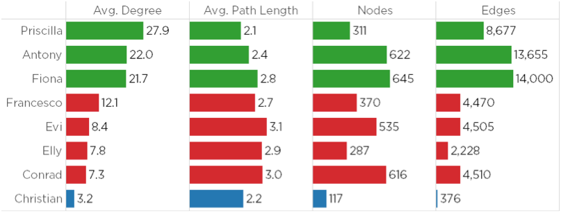
- Nodes: the number of friends in the social network
- Edges: the number of relationships between the nodes
- Avg. Path Length: the average number of steps along the shortest paths for all pairs of network nodes (the “length” of the network)
- Avg. Degree: how many friends in common with the “average friend” (edges divided by nodes)
After extracting the data using Netvizz, we imported the data into Gephi, a data visualisation tool. First we produced a chart visualising these statistics to show the difference in network size between each profile.
By analysing these networks we were able to classify three common Facebook personalities: Hermit, Traveler and Gossiper. The visualisations below highlight the differences in these personalities.
The Hermit: has a small group of friends that are closely connected.
The Traveler: has a large network with clearly defined groups of friends, high connections within groups but a low number of connections between groups.
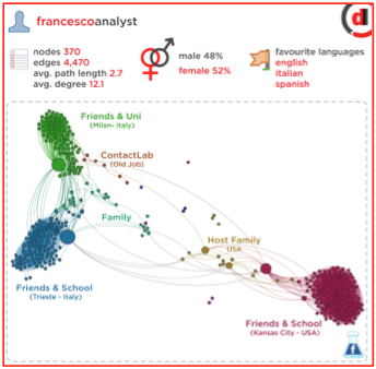
The Gossiper: These people have highly connected friends and a high number of connections within and between groups.
While this is an interesting exercise to visualise the often unseen data within your social networks, there are practical implications for such an exercise. In a professional sense, you would be able to visualise the interconnections between networks and map out an approach to utilise the various networks for self-promotion or solidifying your audience.
As a business, you would have the ability to see the relationships between your various customer demographics and have a clear visual of your marketing segmentation. You can better understand the relationships between your customers and target accordingly.
Data is yet to be fully democratised as there is still a great discrepancy between the data available and the ability for many businesses to make sense of that data. Using simple tools like Gephi and making use of small data sets available to you gives you the chance to develop an understanding of how data can be visualised and applied to your business.
That way, when it comes to looking at more complex data sets such as your customer base or site traffic, you have some idea of what you’re looking for and how you can go about visualising the data.